1
2


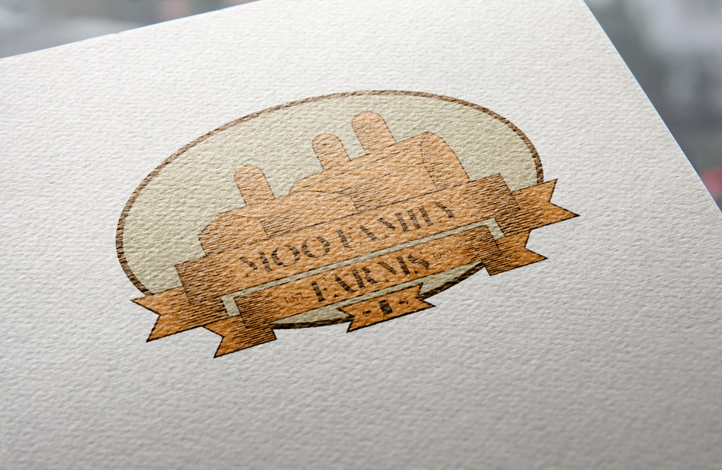
When prompted to make a logo for the ice cream company Moo Family Farms, I knew I wanted to create something vintage looking. I wanted to give this old-timey feel to the company to showcase family tradition. In addition, I kept the palette a neutral brown to call to mind cardboard, pushing a much more environmentally friendly nature to the ice cream. My idea would be to have the containers for the ice cream reflect this same environmentally friendly nature as the logo seeks to do. The image on the logo is a simplified depiction of the farm in which the milk and cream come from. At the base of the logo, a milk bottle can also be seen, harkening back to the roots of the company.